
Today we researched into Saul Bass and his wife. Saul Bass was an american graphic designer as well as a filmer maker. He was born in 1920 and died in 1996. Saul bass and his wife, Elaine, remain prominent in the eyes of title sequence designers internationally to this day. From a young age, Bass was very creative, he was always drawing and he later attended an art college.

In the 1940's he left New york (where he was living) and moved to California to jumpstart a career in advertising. This led him to his first big break when he a made poster for a 1945 film: Cameron Jones. The filmmakers spotted his talent and further requested his work for the title credits as well, and this was a game changer for Saul.

Within his 40 year career Bass worked for some of the best filmmakers of all time, including Martin Scorsese, Kubrick, and Alfred Hitchcock. He became well-known after making the title sequence for "the man with the golden arm" Bass went on to do big movie, like West side story and the Shining.
This is another key example of the Basses' work:

Not only did Bass work on title sequence designs, he began, in the early stages of his career, designing logos for brands with his experience from art college. He did the logos for Kleenex, Bell, and many more.


These are examples of the products that their talents combined together created. They then moved away to spend time with their children and step away from filming making for a bit. Saul Bass was later 're-discovered' and became well known for his work with

It is said that all modern opening title sequences that introduce the theme or mood of a film are a legacy or inspired by the Basses' work.
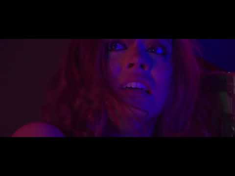
VERTGIO (1958)

After watching this title sequence we can gather from it's main conventions that it's a physcological thriller. The psychedelic patterns used throughout the sequence portray the mystery and AN abstract theme. The red wash in the first image is indicative of a thriller, as red often connotes danger or distress.


I think it works so well because each picture and title blends into one and other which, again, gives the dazed, intoxicated affect which introduces itself to the audience from the very beginning. The font of the titles are quite classic and don't portray that much about the theme. The white writing juxtaposes the dark colours behind it which makes the credits stand out. The size is not to big but noticeable in comparison to what's portrayed in the image.


No comments:
Post a Comment